steel

HGTV Designer Showcase-July 2015 by Paula


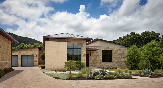
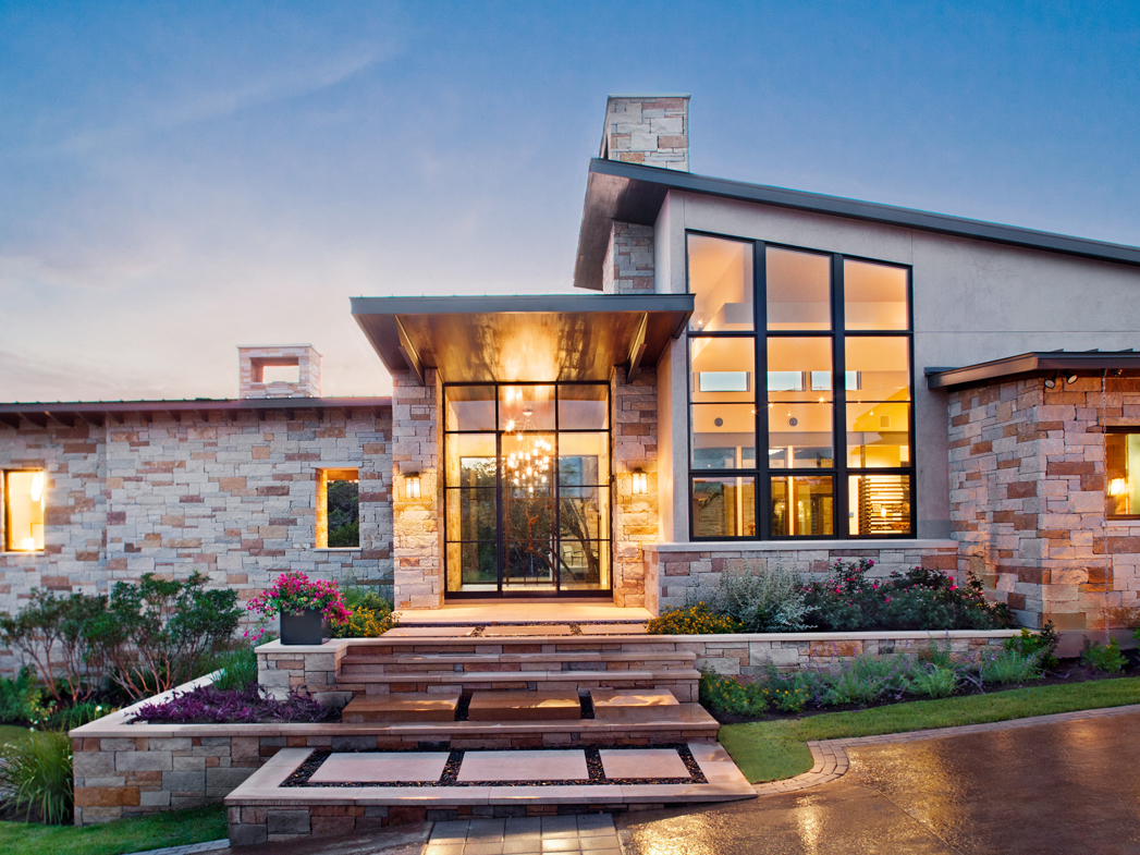
Paula Ables Interiors is excited to be included in the HGTV Designers Showcase Series.  This wonderful article by Morgan Galbraith features our Spanish Oaks Hill Country Contemporary House on the outskirts of Austin, Texas.

Comfortable, Contemporary House Blurs Lines Between Indoors and Outdoors

A young newlywed couple wanted a comfortable, contemporary home that complemented their outdoor lifestyle. Designer Paula Ables drew on the property's surrounding nature as she created a home that the couple could enjoy for years to come.

Spanish Oaks Contemporary House-designer

When a young couple approached Paula Ables for help creating a home where they could feel comfortable for a long time, the Austin, Texas designer looked to their love of the outdoors for inspiration.


The newlyweds' property was the perfect spot to blur the lines between indoor and outdoor living thanks to its proximity to a greenway and wildlife.


“It was all about bringing the outside in, keeping that comfortable feel, making sure all of the furniture was oriented in the right direction so that you were able to enjoy the wildlife and enjoy the green belt beyond with the quietness and serenity of the area,” Ables says.

HGTV photos-designer

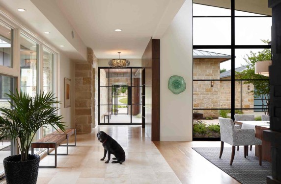
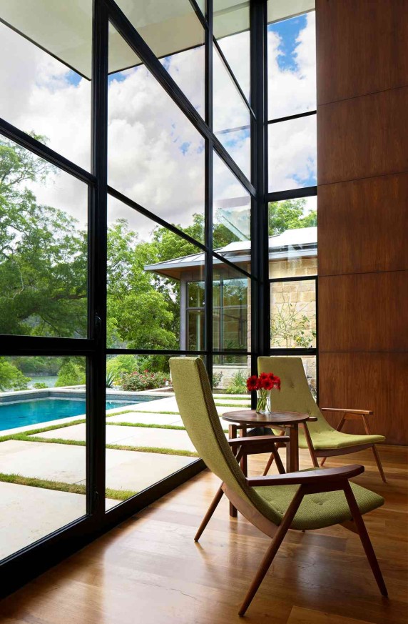
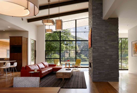
Soaring ceilings and oversized windows let in bright, natural light and views of the surrounding Texas landscape. Ables maintained an open floor plan among the kitchen, living and dining rooms to take advantage of the light and the views.


To further blend inside and out, Ables selected a neutral color palette for the home that complemented its surroundings and kept windows bare of coverings.


“We tried to keep the color palette fairly similar so that walking from one space to the other wasn't a shock to your senses,” Ables says. “It was always just a nice soft even flow from one space to the next.”


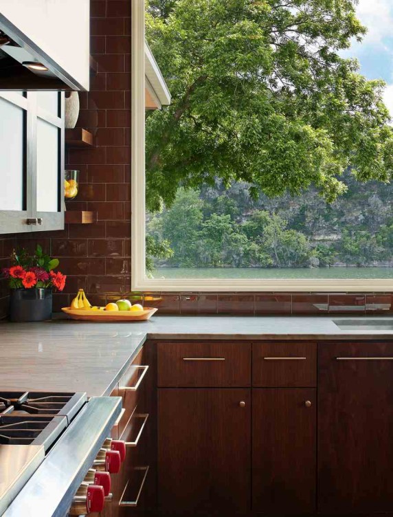
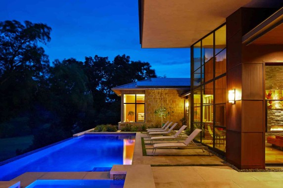
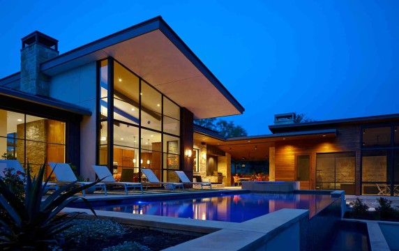
A stunning swimming pool and outdoor living room with fireplace offer spots for the couple to be outside with their friends and family. Inside, Ables selected easy-to-clean materials so that the constant movement between indoors and outdoors wouldn't result in hard-to-clean messes.


"We like to try to take the feel of the outside and bring it inside so that the house flows really softly and simply for entertaining as well as for their general use."    -Interior Designer Paula Ables


Ables helped accentuate the separation of the master bedroom and other private living areas from the more public living spaces with a breezeway to offer the couple privacy when they want it and to give the home the look of one that had evolved over time.


  “They wanted to feel like the house was pieced together like it had been built over time rather than all at one time,” Ables says.


Small details such as mismatched flooring tiles, rectangular sinks and hidden tape lighting seem almost insignificant up close. As a whole, they offer a sense of history to the home.


“I think it's those little details and hidden elements that give it so much more character and so much more interest,” Ables says.


To read more about Interior Designer Paula Ables, see link below.


Click here to see more Publications featuring Paula Ables Interiors.
3 Steps to Creating your Living Wall by Paula

Now that it's summer it is time to move your gardens and plants back outside...but have you thought about moving your gardens ON the walls? Yes, we're seeing everyone pick their tomatoes & peaches and create delicious meals from their new sprouts, but we're also seeing a new craze...vertical garden walls [or living/green walls as some people call them]. People are literally buying hundreds of succulents, cacti, and grass roots and planting them on their wall. Sounds crazy, but we love it!

This live wall concept has been around for a while but has recently become extremely popular.

With the warmer weather coming, we have been planning this post (since it's best to plant during Spring & Summer), but recently Paula visited the Dwell on Design Exhibit in Los Angeles and saw various, luscious live walls to inspire the blog even more!

live wall-living

First of all there are 3 main things to consider when installing a live wall. We will walk through each one of them to help you create the best one for your home!

1. Space

How much room do you want to allot for your living wall?

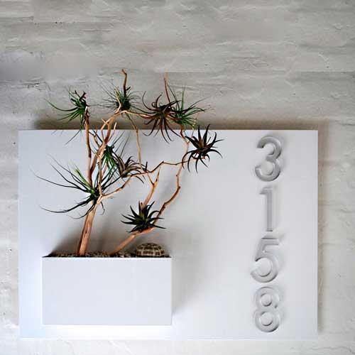
There are wall planters that are as small as one little vase--which look great next to your front door, or inside by your office desk.

pottedstore1-living we are scout-living

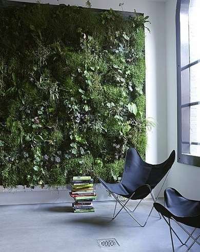
And then there are HUGE planters that can take up an entire wall on your back patio, or interior living room.

april and may studio blog-living contemporist blog-living

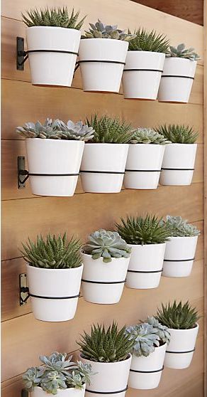
Of course the most options lie between the small planters and the huge walls...From pots you can attach to your wall, to wooden frames full of succulents, the options really are endless.

crate and barrel-living etsy-living

2. Cost

Obviously, the bigger the plant wall, the more money it's going to cost. If you are going to go really big, we suggest hiring a professional. This will allow you to customize the perfect design for your space without wasting any time or resources.

Many of the larger wall systems are plumbed with a water drip system (which is hard to self-install) to keep the plants well fed and consistently happy across the board.

green prophet-living

If your project is smaller and does not need professional help, but you don't want to start from scratch, there are affordable starter kits or pre-made gardens [for example, the image below is multiple modular pieces from Succulent Gardens Company]

succulent gardnes1-living

Another easy-to-use wall planter is Skale Greenwall. You can install it & customize it yourself [for a pretty penny]. But may be worth  the cost, because the result is beautiful!  Why reinvent the wheel when you can purchase ready made systems from the pros?

skale greenwall-living

Now there are hundreds of companies & landscape architects that will build a vertical garden for you (we suggest looking up local landscape companies). While this may not save you money, it will save you a lot of time. Live walls can be tedious to build depending on which plants you use...which brings us to our next point!

3. Types of Plants

Now the fun part! Picking out your plants.

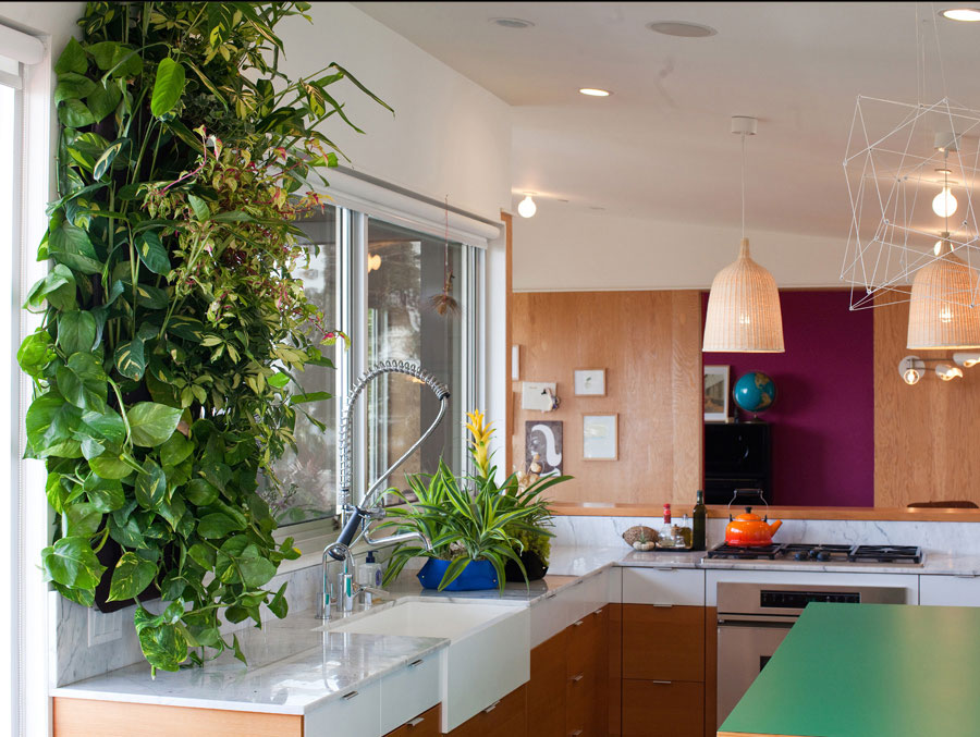
People typically think of succulents and cactus for their green wall plants, but grass & more leafy plants can be great for taking up more space with less costs.

wollypocket3-living living wall system-living

It really doesn't take a lot to create an attractive succulent garden. Since they are from the same family of plants they all seem to compliment each other greatly. Creating clusters of the same types of succulents will make for a very eye-catching display. Just be sure the succulent wall has plenty of sunlight since that is what makes these plants thrive.

flora grubb-living

You may also consider using your wall planter for herbs and flowers...Especially if you live in an apartment or office with no outdoor gardening space, this can be an amazing resource for cooking and for extra fresh air!

williams sonoma-living

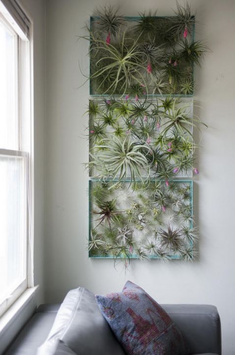
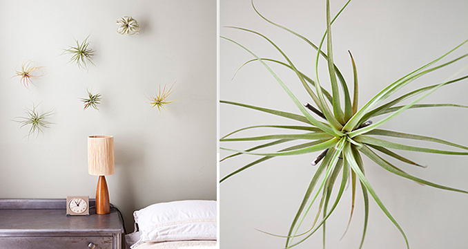
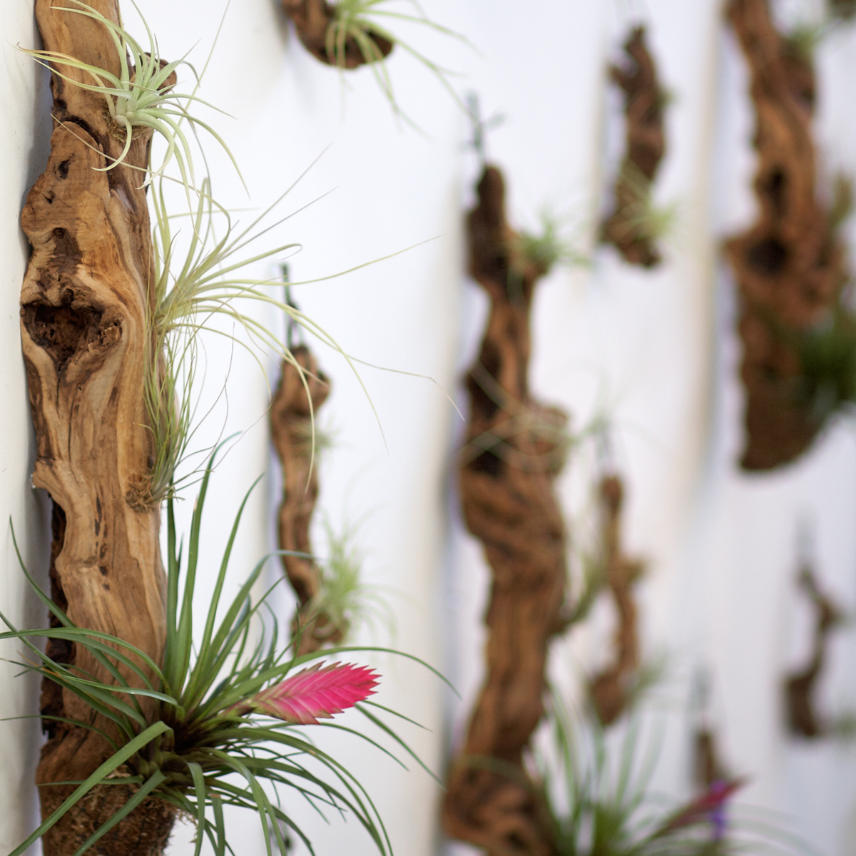
Lastly, consider air plants! These are the easiest plants to care for and they are very eye-catching and appealing in any room! We always love the fun touch they add.

flora grubb air plant-living airplantman-living decorating your small 2-living

If you are still hesitant about taking the green wall plunge, consider the many benefits:

Improved air quality, reduced energy costs, reduced noise levels, & of course amazing aesthetics.


If you would like a live wall in or around your home and don't know where to start, feel free to reach out to us! We may not be landscape designers, but we are true Pros when it comes to space planning and balance within your room or space.  We would love to work with you to create the best look/most complimentary space for your new wall!

Click here to see more blog posts by Paula Ables Interiors.
Helen Thompson - "Windows on Our World" by Paula

Helen Thompson is an Austin-based writer, producer, stylist and blogger, and she recently featured Paula Ables Interiors in an article! We love the Lake Austin Contemporary project she wrote about, and are so happy to have it published again! You can read the full article here, or on her website.


WINDOWS ON OUR WORLD

This limestone-and-stucco house by architect James LaRue and project manager Emily Marks is for an active family that enjoys hunting, fishing, swimming, and entertaining. Its location on Lake Austin is ideal for the enjoyment of the outdoors, but LaRue and Marks also created space for privacy. They designed a series of rooms and courtyards, in part to focus the view on the lake, and interior gardens that are extensions of the main rooms. They arranged the most-used spaces—the screened porch, living and dining rooms, and the master suite—to take advantage of the views. Garage and guest rooms were positioned closer to the street.

shorevista1-windows

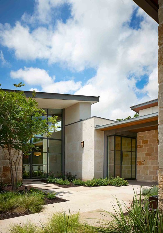
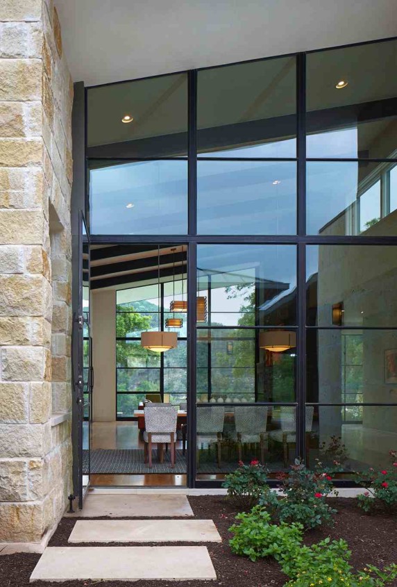
The exterior walls are made of antique Lueders limestone; stucco from Waterloo Plastering is finished in a putty color.

shorevista2-windows

The house is sliced through by a dog trot, which also serves to point the view to the lake and the nature preserve beyond.

shorevista3-windows

Landscape is by Tim Benton and Ramon Suarez, Land Restoration.

shorevista4-windows

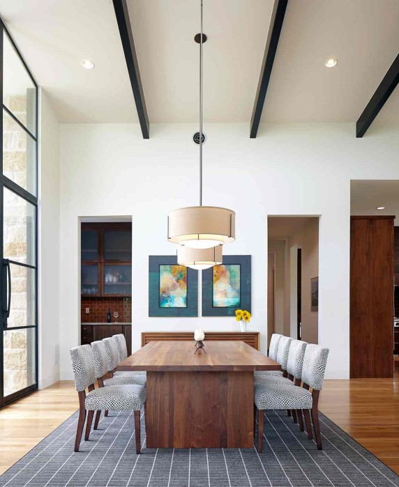
Interiors are by Paula Ables, who used a Radici USA wool rug to anchor the dining table by Lundon Furniture from Room & Board. The McCreary Modern chairs are also from Room & Board. Pendants are by Hubbardton Forge.

shorevista5-windows

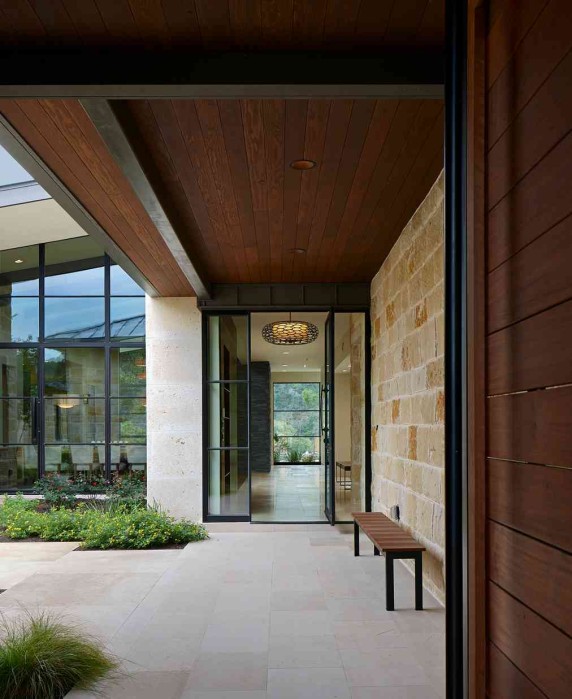
The house is linked by steel-gridded Portella doors and windows. Entry floors are ivory travertine; in the dining room they are white oak.

shorevista6-windows

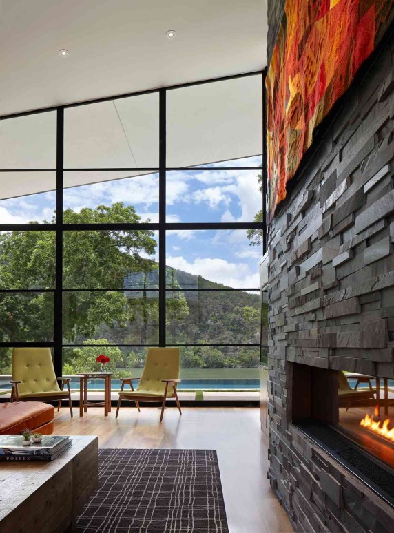
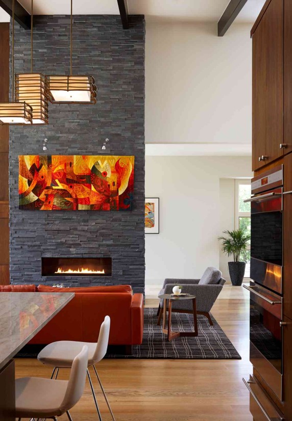
The slate fireplace surround is from Stone Solutions. The American Leather sofa is from Room & Board; the recycled pine coffee table is from Four Hands.

shorevista7-windows

The green chairs in the living room are a pop of color taken from the homeowners’ favorite tapestry, hanging above the fireplace (see below).

shorevista8-windows

Pendants are by Kichler Lighting. Rug is by Stanton Carpet.

shorevista9-windows

Kitchen, dining, and living room open on to each other—the view of the pool and nature preserve are the focus of the room.

shorevista10-windows

Another good view—this house borders on a drainage ditch on one side and has encroaching neighbors elsewhere, but LaRue focused every room on the assets of the lot and the nature preserve across the lake.

shorevista11-windows

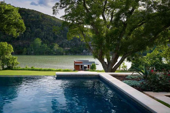
The pool makes a visual connection to the lake.

shorevista12-windows

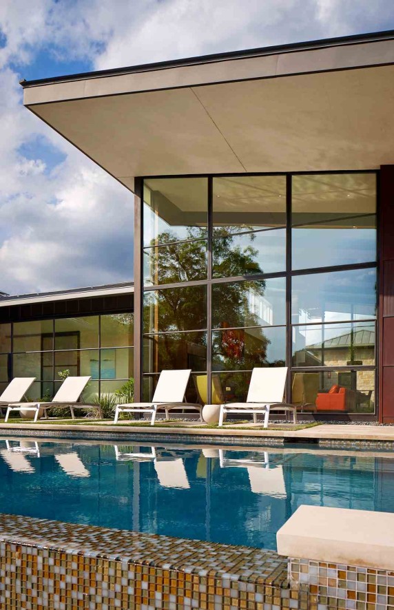
Tropitone chaises are ready for lounging.

shorevista13-windows

The connection between indoors and outdoors is seamless.

4shorevista13-windows

The screened porch (on the right) is faced with Spanish cedar siding and is connected to the main house by a roof that creates another outdoor space.

shorevista15-windows

The garage is on the left; guest suite on the right. Landscape is by Tim Benton and Ramon Suarez, Land Restoration.

PHOTOGRAPHY BY DROR BALDINGER


Click here to see more Publications featuring Paula Ables Interiors.