austin

HGTV Fresh Faces of Design Competition by Paula

Fresh Faces of Design

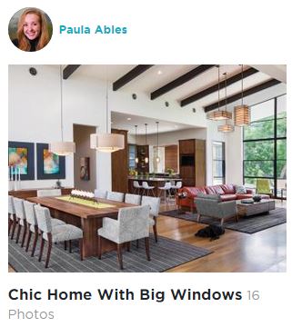
Paula Ables Interiors is proud to be one of the 12 nominees in the "Organically Designed" Category of the HGTV Fresh Faces of Design Competition!


Fresh Face of Design Badge


I need your help to win my category and move on to the next level of competition.  Hit the "Category Nominee" button above and you will go straight to my Category on the HGTV website.  You will need to go through approximately 10-20 photos for the "Organically Inspired" Category, then a "Vote" button will appear on my photo.  You can vote once a day.  EVERY DAY!!!  So put it on your schedule with your morning coffee.  This is what the middle of the page will look like:

FFDC

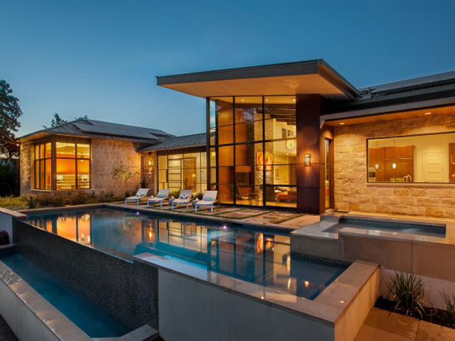
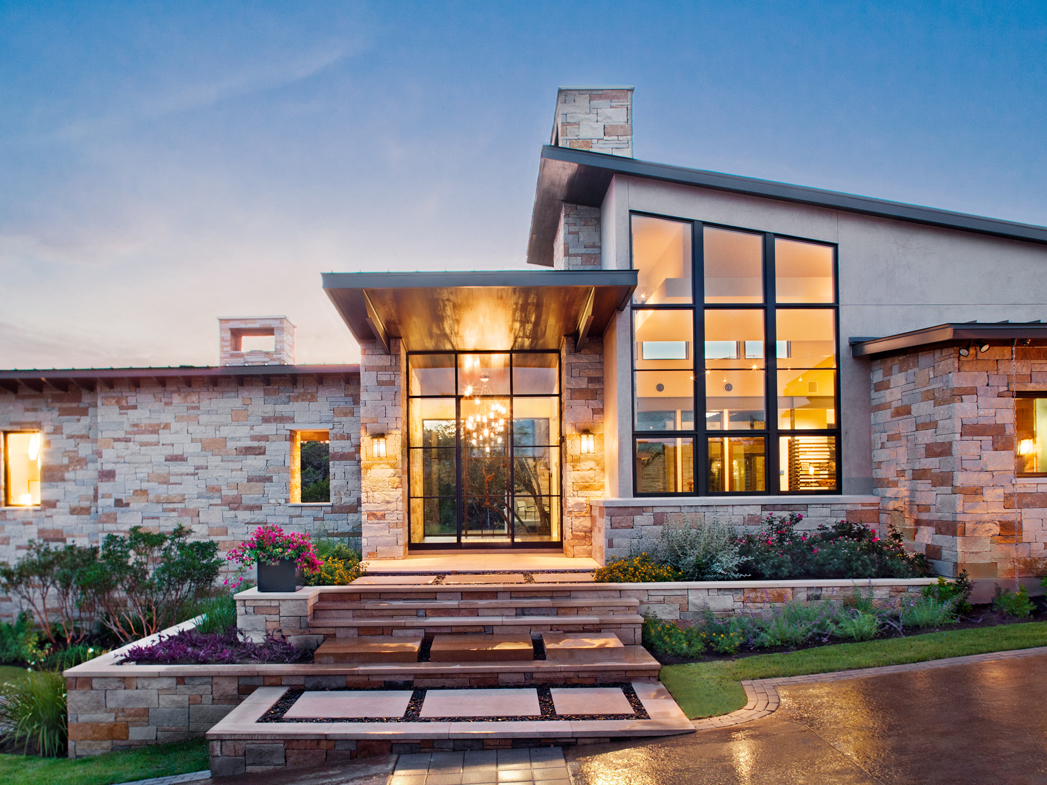
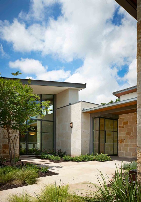
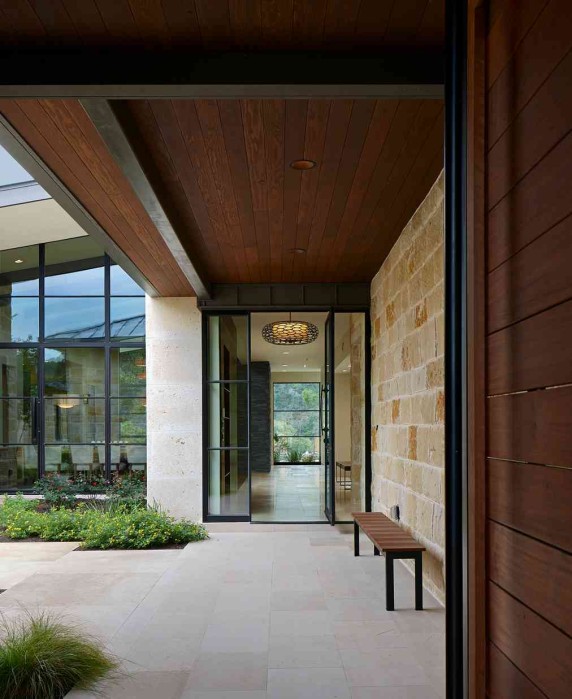
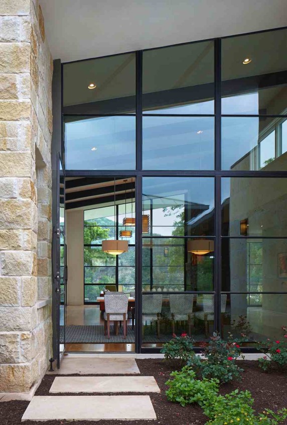
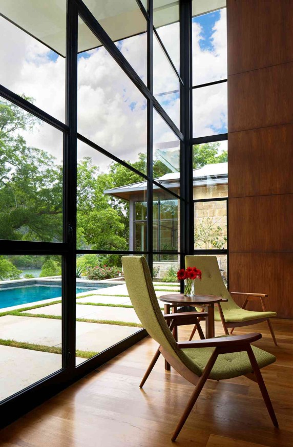
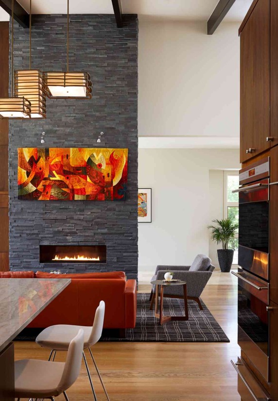
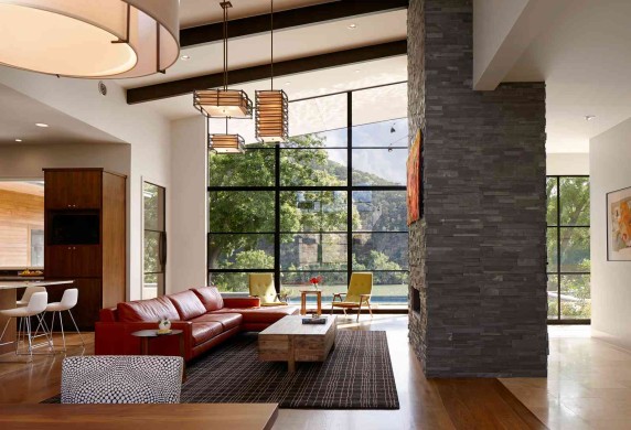
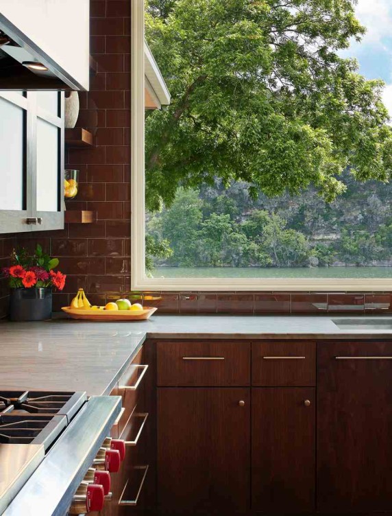
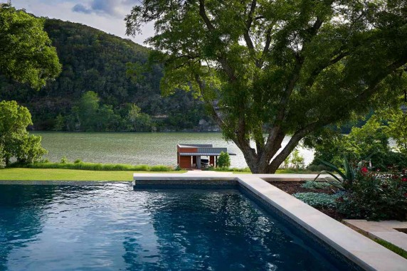
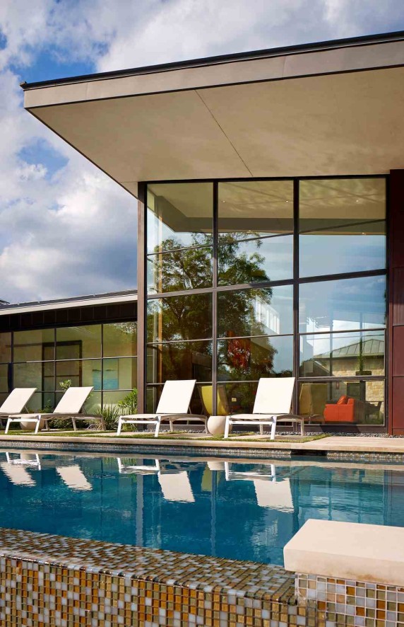
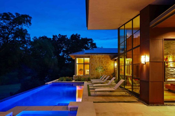
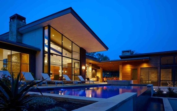
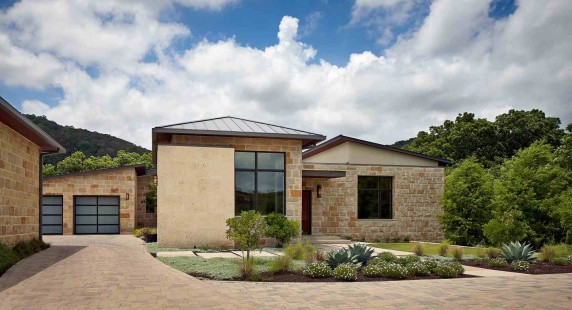
The beautiful house that was nominated is one of our latest jewels,  The LAKE AUSTIN CONTEMPORARY house on our website.

Rear Elevation


To tell you a little about the Competition, there are 11 categories with up to 12 nominees in each category.  You can vote once a day.  Voting Begins on September 25th at 9am and ends on October 30th @5pm.  Once the voting is over a panel of celebrity judges will convene to choose the overall winner of the competition.  Overall Winner and Category Winners will be announced on November 3rd on the HGTV website.


Thank you so much for your support during this exciting competition.  Don't forget to VOTE TODAY!!


About HGTV

America’s leading home and lifestyle brand, HGTV features a top-rated cable network that is distributed to more than 96 million U.S. households and HGTV.com, the premier source for home-related inspiration, instruction and entertainment, attracts more than six million people each month. The brand also includes the HGTV HOME™ consumer products line which showcases exclusive collections of paint, flooring, lighting, furniture, plants, fabrics and other home-oriented products. For more information on HGTV HOME branded products and to find a retailer, go to www.hgtvhome.com. In partnership with Hearst Magazines, the HGTV Magazine, a home and lifestyle publication, is currently available on newsstands. Viewers can become fans of HGTV and interact with other home improvement enthusiasts through Facebook, Twitter, Pinterest and Instagram. Headquartered in Knoxville, Tenn., HGTV is wholly owned by Scripps Networks Interactive, Inc. (SNI).


Click here to see more blog posts by Paula Ables Interiors

6 steps to consider when designing a kids closet by Paula

Kid's closets are an interesting challenge.  They are often the smallest closets in the house and you are trying to hide the most items in there.  I hear many parents say, "it is just a kid's closet, they don't need anything fancy".  We understand where they are coming from, but disagree with that way of thinking.  A child's closet is the "organization training wheels" to teach your kids a few important life skills at an early age.  For this blog we collaborated with one of the owners of California Closets Texas Hill Country, Jill Siegel. California Closets


1. Make sure you have enough shelves:

Here is the big question-What hangs and what folds?  Depending on your child's stage in life, the answer could be very different to this question.  With smaller kids you tend to fold more of their tiny clothes. The older they get, the more you hang.

20100322_cc_lee_1728_8bit

2.  Make sure there is a place for dirty clothes:

Think of this closet design as teaching your child one of the more important life skills you can teach-organization.  There is a place for everything and everything has its place.  Where do the dirty clothes go?  Where do the clean clothes go? There is no doubt the answer to this question when you take the time to plan ahead.

California Closets


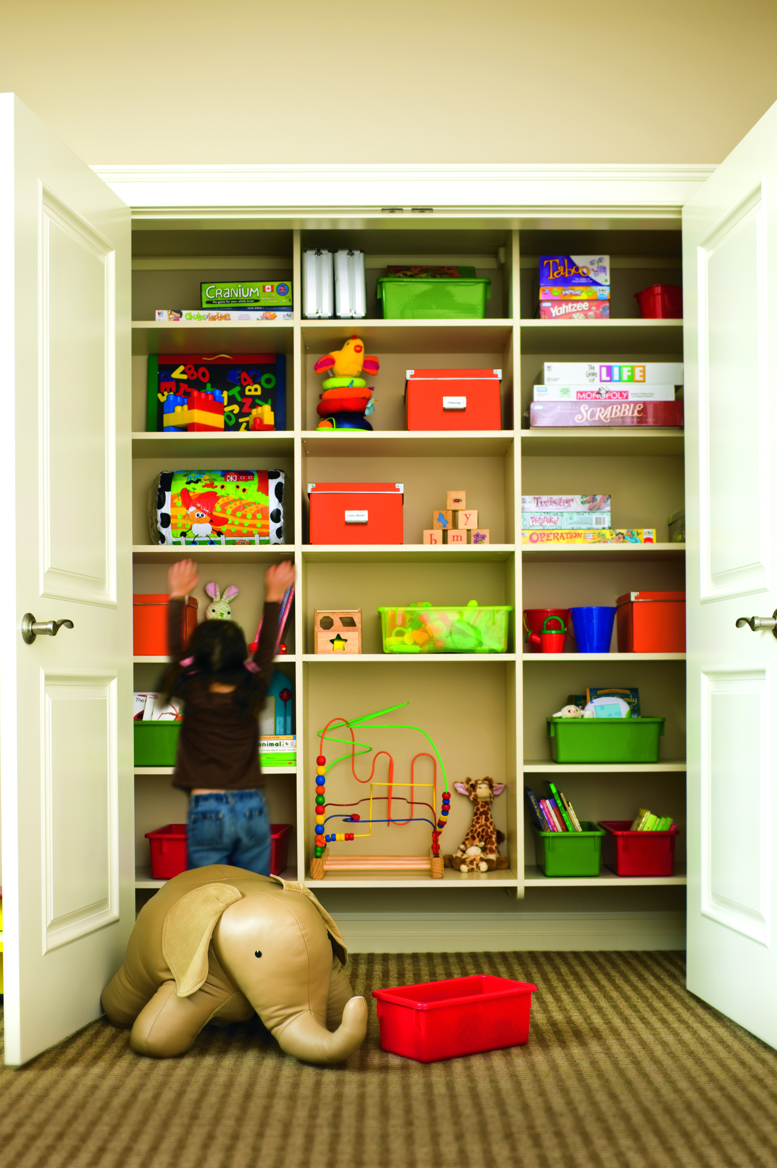
3.  Make sure there is plenty of room for toys:

Kids are more likely to put things away if there are specific places for their toys to go.  Create shelf spaces in your child's closet that are fitted for specific items, such as bins for putting smaller toys and larger openings for some of their larger toys.

California Closets


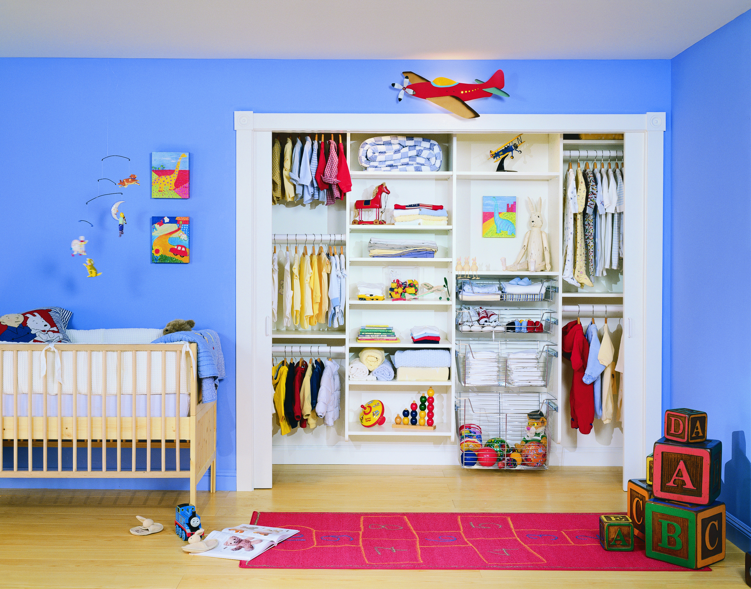
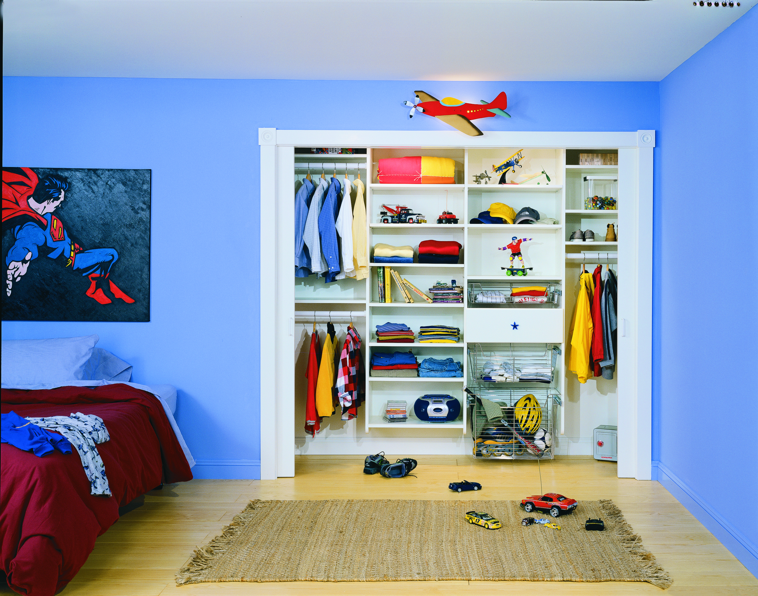
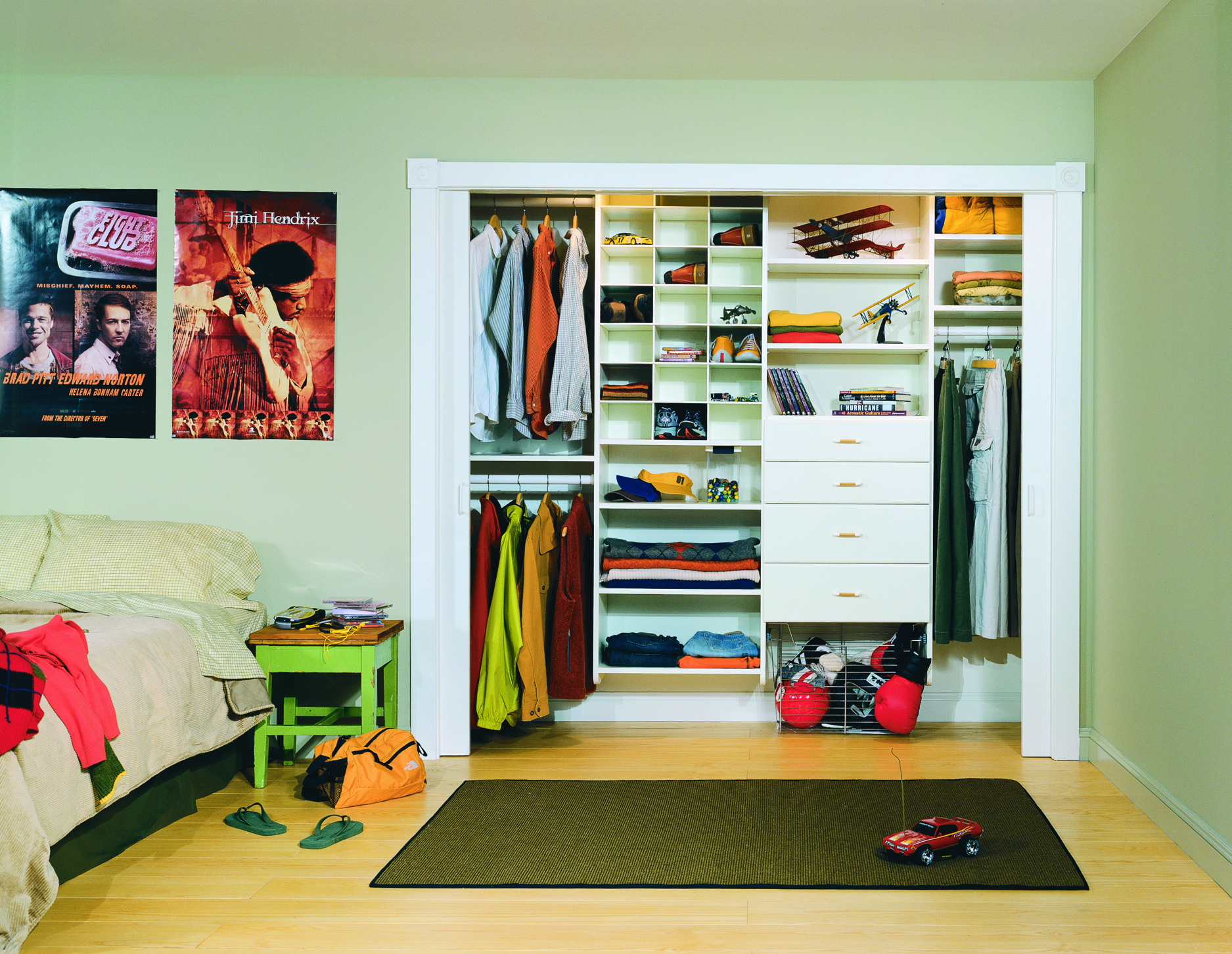
4.  Plan for your closet design to adjust as your child grows:

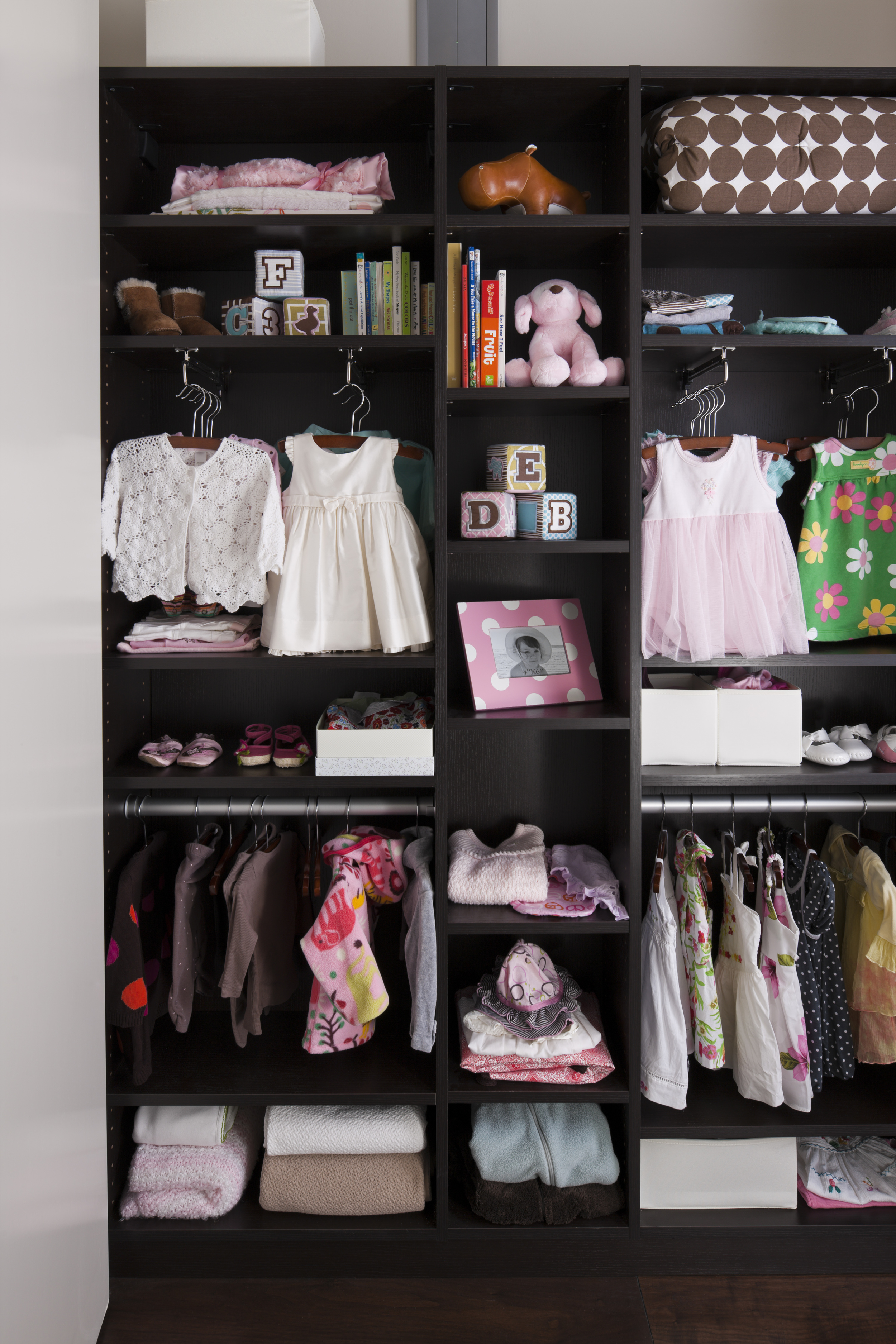
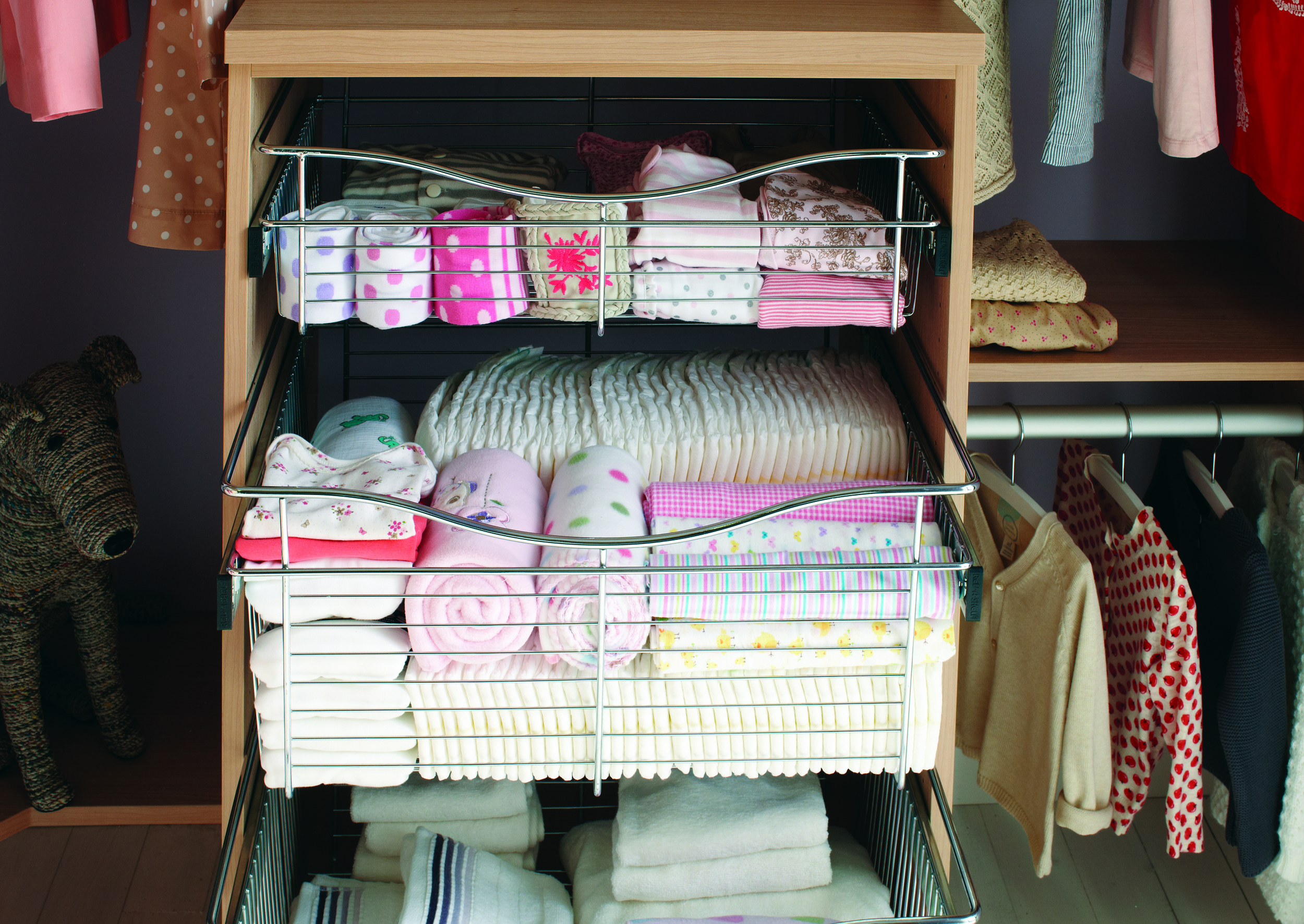
No matter the size of your child's closet, organization abilities should grow with your child as their wants and needs change.  As an infant you may need more shelf spaces for folded clothes, blankets and diapers. As a toddler you need more space for toy organization and a few additional hanging clothes. Finally, as a teen the need to organize toys goes away and gives way to the need for drawers to hide large folding items and shoe bins.

01INFAD 01KID (1)
01TEEN


5.  Make it fun:

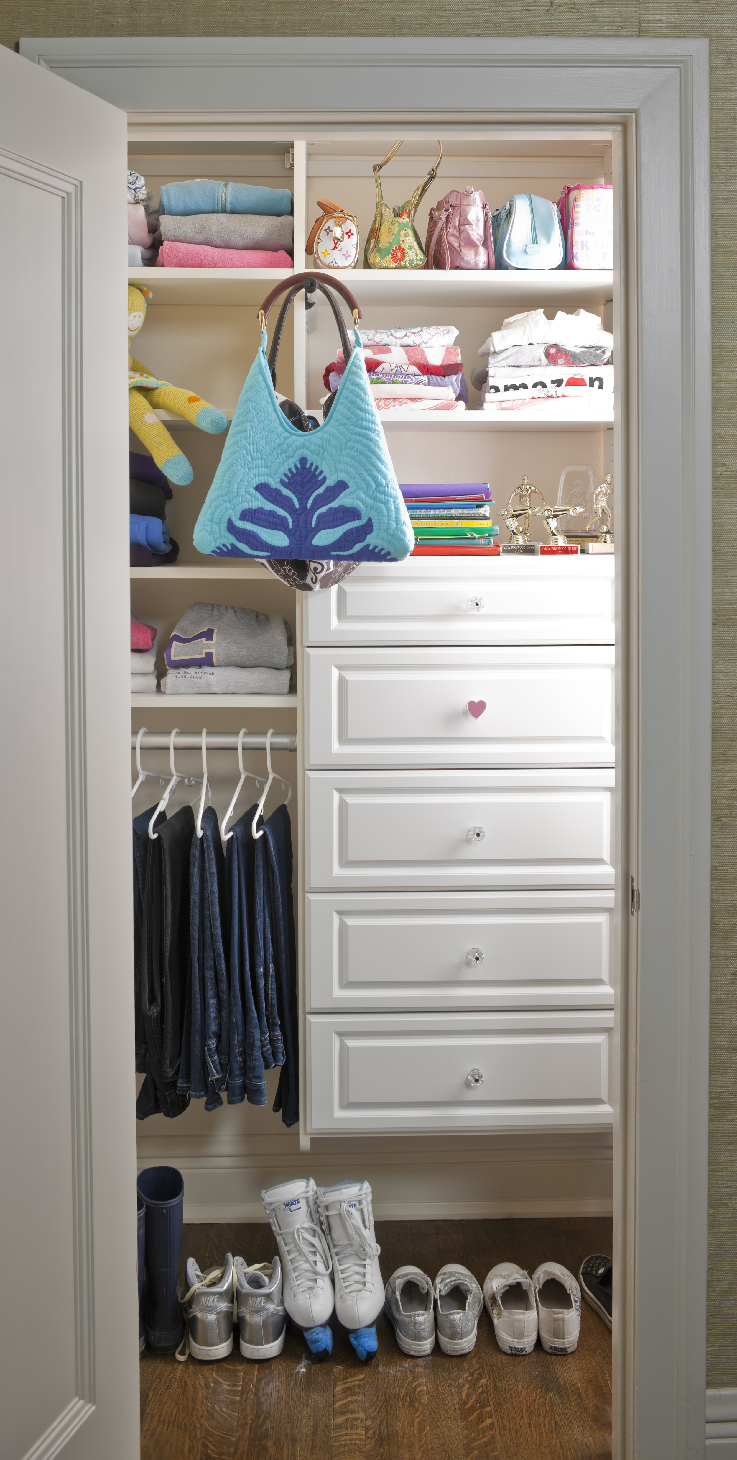
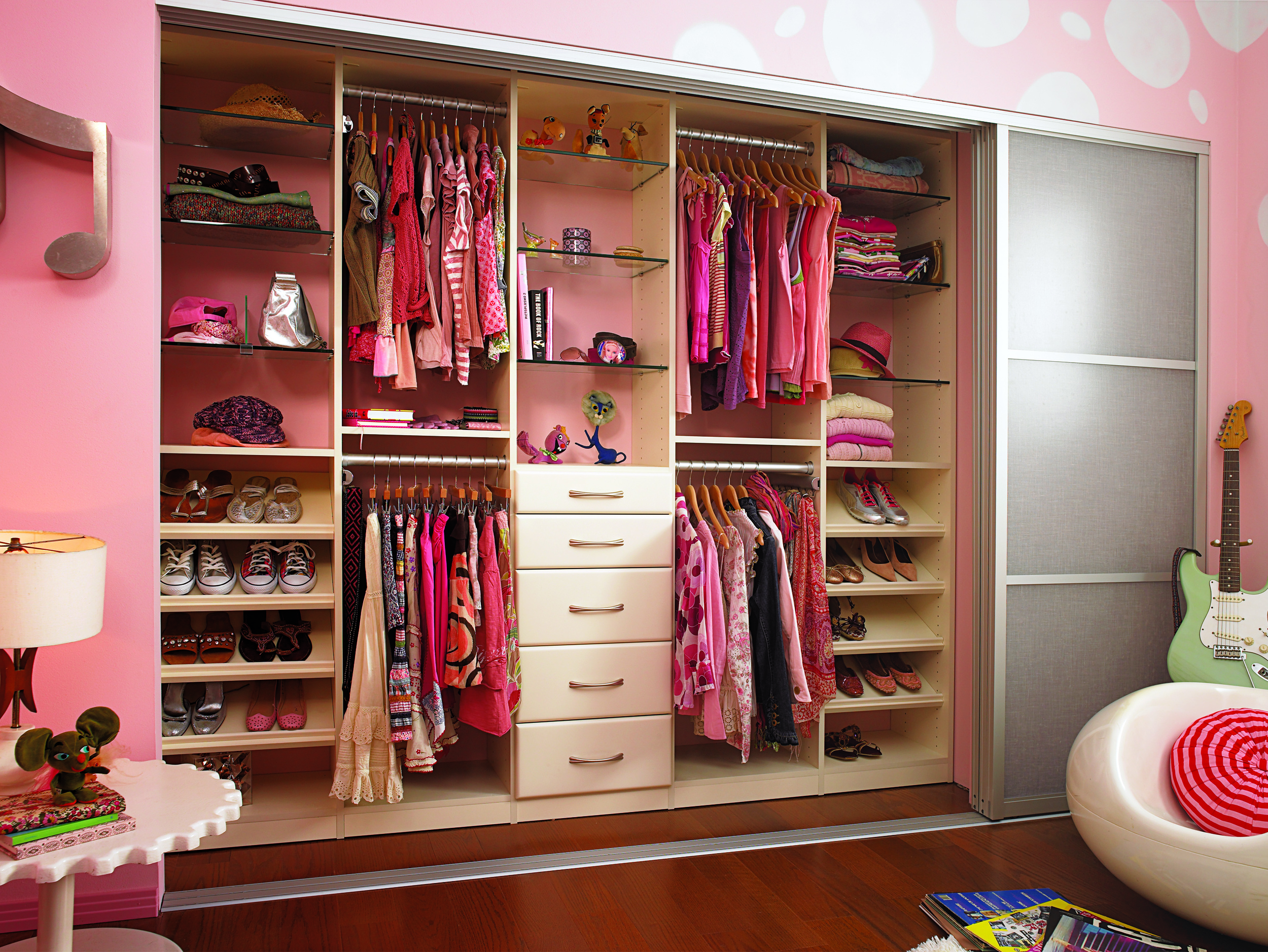
Closets don't have to have drab white walls and painted shelves, they can be fun like the photo below.  Take your child's closet and make it a space they want to spend a little time in.  They will enjoy all the fun little details you can add for personalization.  There are no set in stone rules here.  If your child has 10 dress-up outfits with matching plastic shoes, plan a space for them that they can reach.  Your child will enjoy knowing where all of their favorite things are and you will enjoy a cleaner room.

06_TEEN_product_05


6. Don't forget to add your organization accessories:

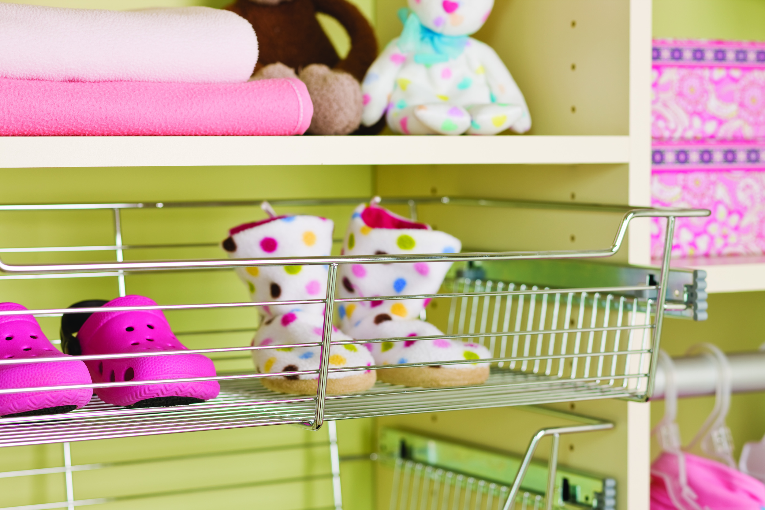
Take advantage of all of the fun organizational items available when creating your child's closet.  The more fun you make it, the more likely they are to use it properly.  A few examples of items that are available include sloped shoe shelves and wire drawers. You can also take it that extra step and add down lighting and glass shelves so some of your areas can appear as decorative display.

California Closets 12_BabyCloset_RevShelfBaskets_Hero


Who says teaching organization and life skills can't be fun?  We think California Closet's concept for children's closets is well thought out, creative and fun.  Our advice to you if you are thinking about hiring a professional to organize your child's closet:  Find a designer that has kids and understands your goals and growth plans.  Thank you to California Closets for providing the wonderful photography above and thank you to Jill for all the great advice for creating and organizing your child's space.

Are you looking to update your child's space, but the thought of touching it makes you swoon, we are here to help.  Our design team has collaborated with California Closets on many different occasions and would love the opportunity to work with you on yours.  Give us a shout.


Click here to see more blog posts by Paula Ables Interiors.  

2015 ASID Legacy of Design Awards by Paula

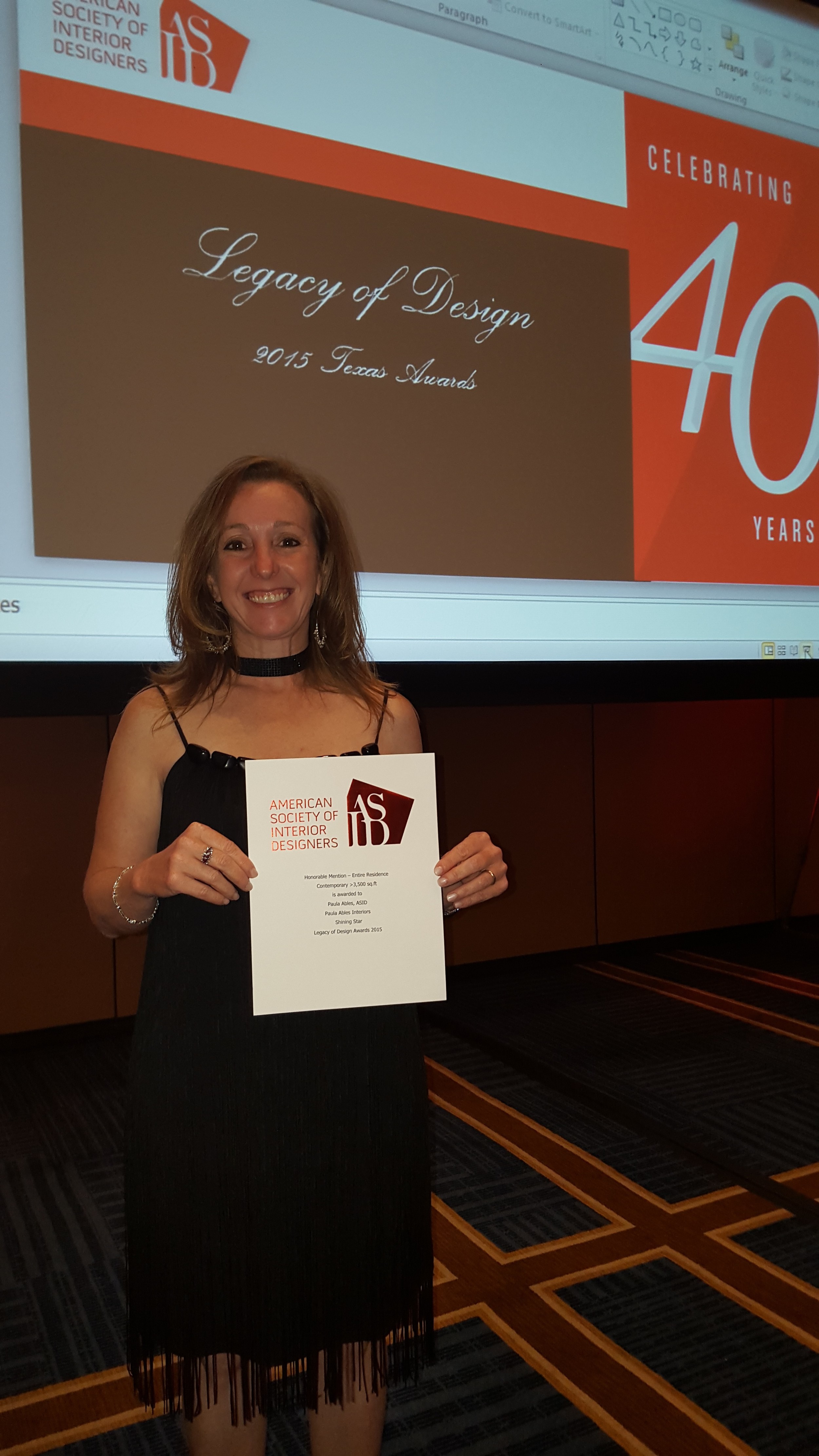
Paula Ables Interiors is excited to have won Honorable Mention at the ASID Legacy of Design Awards for Custom Contemporary House over 3500 sq ft category.

ASID Legacy 2015 Paula Ables Interior Design

 Click HERE to see the award winning Lake Austin Contemporary House.


Click here to see more Publications featuring Paula Ables Interiors.

Add color to your life with Forever Blue by Paula

Blue has forever been a human's favorite color. On average, people prefer blue over any other color.

It can be soothing or bold, but across the board it is aesthetically pleasing.  Blue gives you a sense of calmness and serenity.

And for that reason we love integrating blue into our interior design projects. Whether it's painting an accent wall, a whole room, or pulling in some bright blue chairs or pillows, the color blue always seems to compliment a design and add that final touch.

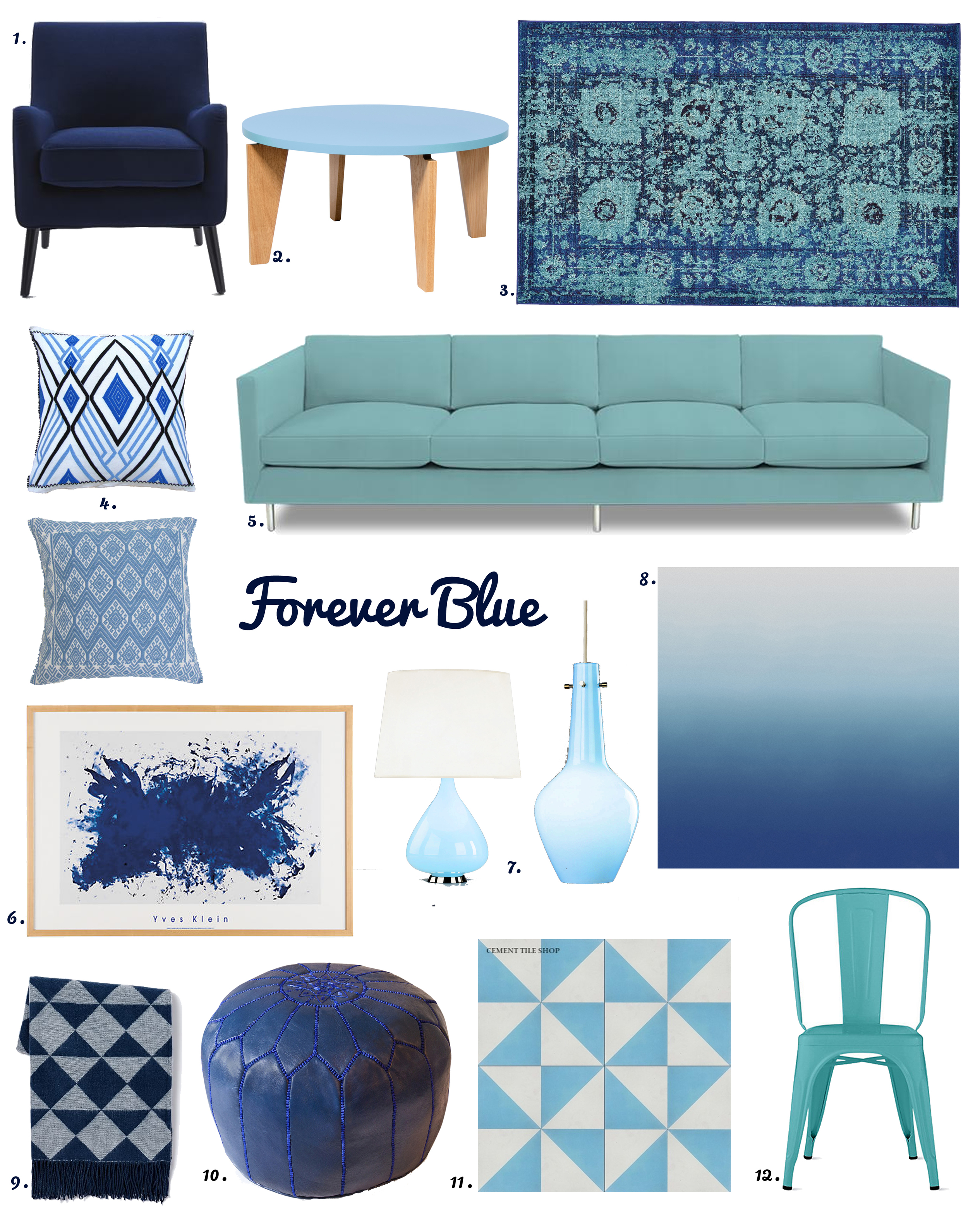
Below are some items that will help you incorporate blue into your home and add that pop of color you might be missing!

Just Blue Accents-with numbers


Blue Product Details:

1. Book Nook Armchair - West Elm - Chairs are the easiest ways to add a pop of blue since the options are endless!   2. Magnolia Coffee Table - InMod - We love this color of blue and it's so fun and unexpected on a coffee table!   3. Blue Casablanca Area Rug - Esale Rugs - Rugs are another easy, yet more pricey, way to bring in blue. An area rug like this really does have a soothing effect.   4. Embroidered Pillows - Chiapas Bazaar - Everyone loves beautiful embroidered pillows...especially in blue!   5. Topanga 4 Seater Sofa - Jonathan Adler - A soft turquoise sofa is atypical but so lovely!   6. Klein Homage to Tennessee - Room & Board - Yves Klein got famous off the color blue, if you're wanting to incorporate a classic blue into your home.   7. Capri Lights - Jonathan Adler - We love the idea of capri blue lights around the house, such a fun pop of color!   8. Aurora Azure - Calico Wallpaper - Fresh, buoyant and delightful wallpaper for a unique accent!   9. Triangle Jacquard Throw - West Elm - A super soft throw in an edgy print, perfect for the modernist.   10. Leather Moroccan Pouf - Jonathan Adler - Poufs are the must-have accessory of the year, and why not in blue leather?   11. Diagonal V Tiles - Cement Tile Shop - We love patterned tiles for the kitchen, bathroom backsplash or even for the floor!   12. Tolix Marais A Chair - Design Within Reach - Kitchens are one of the best places to add color and these classic turquoise chairs are the cutest!


If you love the idea of taking your home from "A tribute to tan" to something more fun and exciting but don't know how, we would love to help! Feel free to reach out to us.

Click here to see more blog posts by Paula Ables Interiors.  

HGTV Designer Showcase-July 2015 by Paula


Paula Ables Interiors is excited to be included in the HGTV Designers Showcase Series.  This wonderful article by Morgan Galbraith features our Spanish Oaks Hill Country Contemporary House on the outskirts of Austin, Texas.

Comfortable, Contemporary House Blurs Lines Between Indoors and Outdoors

A young newlywed couple wanted a comfortable, contemporary home that complemented their outdoor lifestyle. Designer Paula Ables drew on the property's surrounding nature as she created a home that the couple could enjoy for years to come.

Spanish Oaks Contemporary House-designer

When a young couple approached Paula Ables for help creating a home where they could feel comfortable for a long time, the Austin, Texas designer looked to their love of the outdoors for inspiration.


The newlyweds' property was the perfect spot to blur the lines between indoor and outdoor living thanks to its proximity to a greenway and wildlife.


“It was all about bringing the outside in, keeping that comfortable feel, making sure all of the furniture was oriented in the right direction so that you were able to enjoy the wildlife and enjoy the green belt beyond with the quietness and serenity of the area,” Ables says.

HGTV photos-designer

Soaring ceilings and oversized windows let in bright, natural light and views of the surrounding Texas landscape. Ables maintained an open floor plan among the kitchen, living and dining rooms to take advantage of the light and the views.


To further blend inside and out, Ables selected a neutral color palette for the home that complemented its surroundings and kept windows bare of coverings.


“We tried to keep the color palette fairly similar so that walking from one space to the other wasn't a shock to your senses,” Ables says. “It was always just a nice soft even flow from one space to the next.”


A stunning swimming pool and outdoor living room with fireplace offer spots for the couple to be outside with their friends and family. Inside, Ables selected easy-to-clean materials so that the constant movement between indoors and outdoors wouldn't result in hard-to-clean messes.


"We like to try to take the feel of the outside and bring it inside so that the house flows really softly and simply for entertaining as well as for their general use."    -Interior Designer Paula Ables


Ables helped accentuate the separation of the master bedroom and other private living areas from the more public living spaces with a breezeway to offer the couple privacy when they want it and to give the home the look of one that had evolved over time.


  “They wanted to feel like the house was pieced together like it had been built over time rather than all at one time,” Ables says.


Small details such as mismatched flooring tiles, rectangular sinks and hidden tape lighting seem almost insignificant up close. As a whole, they offer a sense of history to the home.


“I think it's those little details and hidden elements that give it so much more character and so much more interest,” Ables says.


To read more about Interior Designer Paula Ables, see link below.


Click here to see more Publications featuring Paula Ables Interiors.

Helen Thompson - "Windows on Our World" by Paula

Helen Thompson is an Austin-based writer, producer, stylist and blogger, and she recently featured Paula Ables Interiors in an article! We love the Lake Austin Contemporary project she wrote about, and are so happy to have it published again! You can read the full article here, or on her website.


WINDOWS ON OUR WORLD

This limestone-and-stucco house by architect James LaRue and project manager Emily Marks is for an active family that enjoys hunting, fishing, swimming, and entertaining. Its location on Lake Austin is ideal for the enjoyment of the outdoors, but LaRue and Marks also created space for privacy. They designed a series of rooms and courtyards, in part to focus the view on the lake, and interior gardens that are extensions of the main rooms. They arranged the most-used spaces—the screened porch, living and dining rooms, and the master suite—to take advantage of the views. Garage and guest rooms were positioned closer to the street.

shorevista1-windows

The exterior walls are made of antique Lueders limestone; stucco from Waterloo Plastering is finished in a putty color.

shorevista2-windows

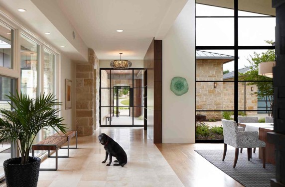
The house is sliced through by a dog trot, which also serves to point the view to the lake and the nature preserve beyond.

shorevista3-windows

Landscape is by Tim Benton and Ramon Suarez, Land Restoration.

shorevista4-windows

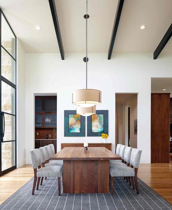
Interiors are by Paula Ables, who used a Radici USA wool rug to anchor the dining table by Lundon Furniture from Room & Board. The McCreary Modern chairs are also from Room & Board. Pendants are by Hubbardton Forge.

shorevista5-windows

The house is linked by steel-gridded Portella doors and windows. Entry floors are ivory travertine; in the dining room they are white oak.

shorevista6-windows

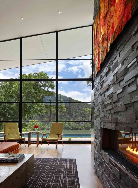
The slate fireplace surround is from Stone Solutions. The American Leather sofa is from Room & Board; the recycled pine coffee table is from Four Hands.

shorevista7-windows

The green chairs in the living room are a pop of color taken from the homeowners’ favorite tapestry, hanging above the fireplace (see below).

shorevista8-windows

Pendants are by Kichler Lighting. Rug is by Stanton Carpet.

shorevista9-windows

Kitchen, dining, and living room open on to each other—the view of the pool and nature preserve are the focus of the room.

shorevista10-windows

Another good view—this house borders on a drainage ditch on one side and has encroaching neighbors elsewhere, but LaRue focused every room on the assets of the lot and the nature preserve across the lake.

shorevista11-windows

The pool makes a visual connection to the lake.

shorevista12-windows

Tropitone chaises are ready for lounging.

shorevista13-windows

The connection between indoors and outdoors is seamless.

4shorevista13-windows

The screened porch (on the right) is faced with Spanish cedar siding and is connected to the main house by a roof that creates another outdoor space.

shorevista15-windows

The garage is on the left; guest suite on the right. Landscape is by Tim Benton and Ramon Suarez, Land Restoration.

PHOTOGRAPHY BY DROR BALDINGER


Click here to see more Publications featuring Paula Ables Interiors.