Need an attitude adjustment? Change the color of your room!
Rumor has it, color change causes mood change. How can this be you might ask? Here are a few examples:
- Some fast food restaurants choose the color orange for an accent or prominent color because it makes you think “Inexpensive” and gets you in and out of the restaurant quickly.
- Hospitals use soothing tones of blue and green to help promote relaxation by making you think of nature and being outside.
- Many bars and nightclubs will combine yellows and reds to make you feel happy and full of energy.

Yes, these are all examples in Commercial spaces. This same line of thinking can be applied when selecting a color for your home as well.
We all know whites are crisp and clean and if you are not careful can go institutional in the
blink of an eye. Neutrals such as taupe and tan are great for staple colors in hallways and secondary rooms. They help to tie your rooms together as a cohesive unit. But how many times have you walked into a home that felt like it was a “Tribute to Tan”? Let’s add some color to your room to see if we can liven things up.
We will start with primary colors:
 |
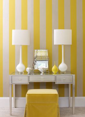
Blue: Light blues are relaxing, calming and soothing. The color makes you think of water and a beautiful clear sky. In your home it is a great color to use in bedrooms and bathrooms. Yellow: The color of sunshine. Whether you are using a soft subtle or a bright in your face tone, yellow makes you happy. In your home it is a great color to use in breakfast rooms and play rooms. It wakes you up and gets you ready for the day. |
 |
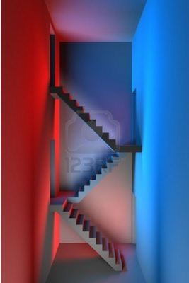
Red: Want to feel excited and energized? Red is your color! Red is great for Game rooms and playrooms where high energy games and brain stimulating activities are a guarantee. Other great areas to use red for a pop of color are Foyer’s, Living and Dining rooms. Whether used as a whole room or an accent wall red will stimulate your heart. (Best to avoid bedrooms and bathrooms as some tones do cause agitation and could undermine the serenity you often seek in these rooms.)
Next we will talk about the secondary colors:
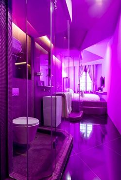 Purple: What a history this color has…purple has always been associated with royalty and luxury. It is wonderful when used as an accent in paint or fabric. When using the lighter tones, purple can give the same feelings of relaxation and serenity as a light blue. As the darker tones have more of a flair for the dramatic, when I think purple, I think VELVET; Soft, luxurious and a wow factor in any room.
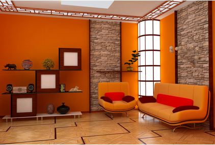
Orange: I mentioned above that orange in a restaurant setting is supposed to make you think inexpensive. It also has other great emotional effects. Like red, various tones of Orange are energizing and exciting. It is great when used in an exercise room and breakfast room.
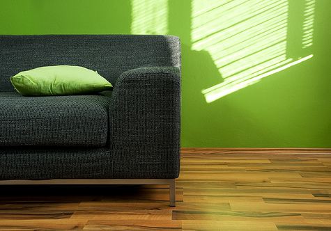
Green: When I think of Zen and peace, I think of green. It is a wonderful mix of the serenity of blue and the cheerfulness of yellow. What more could you ask for in this world? Green is great in any room of the house. It provides interest and energy, yet comfort and relaxation. Rumor has it that green also helps with fertility…an interesting thought. (I would have said red)
Now, go forth and paint or accessorize accordingly! Love the spaces you are in. The cheapest change you can make in your home is painting an accent wall. I promise once it is done you will wonder why you waited so long to do it.
Click Here to See other Blog Posts by Paula Ables Interiors
