mood

Add color to your life with Forever Blue by Paula

Blue has forever been a human's favorite color. On average, people prefer blue over any other color.

It can be soothing or bold, but across the board it is aesthetically pleasing.  Blue gives you a sense of calmness and serenity.

And for that reason we love integrating blue into our interior design projects. Whether it's painting an accent wall, a whole room, or pulling in some bright blue chairs or pillows, the color blue always seems to compliment a design and add that final touch.

Below are some items that will help you incorporate blue into your home and add that pop of color you might be missing!

Just Blue Accents-with numbers


Blue Product Details:

1. Book Nook Armchair - West Elm - Chairs are the easiest ways to add a pop of blue since the options are endless!   2. Magnolia Coffee Table - InMod - We love this color of blue and it's so fun and unexpected on a coffee table!   3. Blue Casablanca Area Rug - Esale Rugs - Rugs are another easy, yet more pricey, way to bring in blue. An area rug like this really does have a soothing effect.   4. Embroidered Pillows - Chiapas Bazaar - Everyone loves beautiful embroidered pillows...especially in blue!   5. Topanga 4 Seater Sofa - Jonathan Adler - A soft turquoise sofa is atypical but so lovely!   6. Klein Homage to Tennessee - Room & Board - Yves Klein got famous off the color blue, if you're wanting to incorporate a classic blue into your home.   7. Capri Lights - Jonathan Adler - We love the idea of capri blue lights around the house, such a fun pop of color!   8. Aurora Azure - Calico Wallpaper - Fresh, buoyant and delightful wallpaper for a unique accent!   9. Triangle Jacquard Throw - West Elm - A super soft throw in an edgy print, perfect for the modernist.   10. Leather Moroccan Pouf - Jonathan Adler - Poufs are the must-have accessory of the year, and why not in blue leather?   11. Diagonal V Tiles - Cement Tile Shop - We love patterned tiles for the kitchen, bathroom backsplash or even for the floor!   12. Tolix Marais A Chair - Design Within Reach - Kitchens are one of the best places to add color and these classic turquoise chairs are the cutest!


If you love the idea of taking your home from "A tribute to tan" to something more fun and exciting but don't know how, we would love to help! Feel free to reach out to us.

Click here to see more blog posts by Paula Ables Interiors.  

3 Things to do when Creating your Home Office by Paula

One of the more common things we are seeing in houses today is a fully functional home office.  More companies are trying to save money on commercial office spaces by having employees work from home and more people are running small businesses from their home. I too went through the work from home phase and was fortunate to have a "work from home professional" (my hubby) to show me the ropes and what NOT to do.  He went through several work phases starting with the laptop table in bed, to watching TV in his pj's while working, to finally realizing he needed to get up, shower, dress for the day and sit at an actual desk to be the most productive.

Some of you reading this now are nodding your heads and laughing because you too have experienced one or more of these phases.  When deciding if it is time to create your new home office, here are a few things to keep in mind while setting up the room to make each day productive and comfortable.

Deck image-home office

1.  Ergonomics for your home office

There are several items to consider to keep you comfortable and healthy in your home office space.  Do a little research to see what works best for the job you do.  Here are a few things to keep in mind when starting your search.

  1. Usergo person-home office
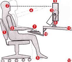
e a good chair with a dynamic back that is angled slightly to the rear.
  2. Top of monitor screen should be 2-3" above eye level
  3. No glare on screen; use an optical glass anti-glare filter where needed
  4. Sit at arms length from monitor; further if distance is comfortable and screen is readable.
  5. Rest feet on floor or on a stable foot rest (move feet frequently for circulation)
  6. Use a document holder, preferably in-line with the computer screen
  7. Wrists should be flat and straight in relation to forearms to use keyboard/mouse/input device
  8. Keeps arms and elbows relaxed close to body
  9. Center monitor and keyboard in front of you
  10. Use a negative tilt keyboard tray with an upper mouse platform or downward tilt-able platform adjacent to keyboard
  11. Use a stable work surface and stable (no bounce) keyboard tray
  12. Take frequent short breaks (micro breaks) and stretch.


2. Lighting for your home office

Lighting in your work space is important.  Having natural sunlight in your home office can make the difference between a happy workspace and a depressing, sleepy environment (see how I said "environment" here, because we all know that no work is being accomplished in a dark and dreary office).  Being able to enjoy a wonderful view of nature is a plus, but having any visual connection to the outside -even if it is just another building- can be beneficial to your work environment.

Having the right amount and type of light is important to prevent eye strain and this is achieved through layering light sources.  Besides natural sunlight it is important to have general overhead lighting to provide an even sheet of light over the entire space to minimize shadows and severe dark to light contrasts that can strain your eyes over time.  Another thing to consider is a good desk/task light to provide additional, focused lighting.

Here are some tips to keep in mind when lighting your work space:desk light-home office

  • Make sure your lamp has enough light output to cover your entire work surface. Having the ability to adjust the placement and direction of the light is ideal.
  • Place the lamp on the opposite side of your dominant hand to reduce shadows when writing or reading.
  • Position your computer screen so it is angled away from the natural light by day and away from the light beam of the desk lamp at night. This will reduce the reflection on your computer screen.
  • Use task lights combined with general lighting for reading, writing or drawing, this helps to avoid eye strain.


3.  Incorporate personal touches for inspiration in your home office

All work and no play can make anyone a dull boy/girl.  Make sure to include things in your space that inspire you.  Whether it is photos of your family, a beautiful piece of art or a mood board to help spur your next brilliant idea.  This is your space, use it how it works best for you.

inspiration-home office


There are many more factors to consider when creating your perfect home office space, it is impossible to cover them all in one blog.  We at Paula Ables Interiors pride ourselves in our ability to listen to your wants and needs and create a wonderful, aesthetically pleasing environment that functions just the way you need it to.  We want you to love the space you are in, whatever that room might be.  Do you have a drab office space in need of some love?  Or are you considering working from home and need to transform a room you can stand to be in for 8 hours, or longer, a day?  We would love to help you get there.

Click here to see more blog posts by Paula Ables Interiors.


Interior Design Tip: Need an attitude adjustment? Change the color of your room! by Paula

Need an attitude adjustment? Change the color of your room!

Rumor has it, color change causes mood change.  How can this be you might ask?  Here are a few examples:

Don't take that tone with me!

  1. Some fast food restaurants choose the color orange for an accent or prominent color because it makes you think “Inexpensive” and gets you in and out of the restaurant quickly.
  2. Hospitals use soothing tones of blue and green to help promote relaxation by making you think of nature and being outside.
  3. Many bars and nightclubs will combine yellows and reds to make you feel happy and full of energy.


Yes, these are all examples in Commercial spaces.  This same line of thinking can be applied when selecting a color for your home as well.

We all know whites are crisp and clean and if you are not careful can go institutional in the

blink of an eye. Neutrals such as taupe and tan are great for staple colors in hallways and secondary rooms.  They help to tie your rooms together as a cohesive unit.  But how many times have you walked into a home that felt like it was a “Tribute to Tan”?  Let’s add some color to your room to see if we can liven things up.


We will start with primary colors:

Blue:  Light blues are relaxing, calming and soothing.  The color makes you think of water and a beautiful clear sky. In your home it is a great color to use in bedrooms and bathrooms.

Yellow: The color of sunshine.  Whether you are using a soft subtle or a bright in your face tone, yellow makes you happy. In your home it is a great color to use in breakfast rooms and play rooms.  It wakes you up and gets you ready for the day.

Red:  Want to feel excited and energized?  Red is your color!  Red is great for Game rooms and playrooms where high energy games and brain stimulating activities are a guarantee.  Other great areas to use red for a pop of color are Foyer’s, Living and Dining rooms. Whether used as a whole room or an accent wall red will stimulate your heart. (Best to avoid bedrooms and bathrooms as some tones do cause agitation and could undermine the serenity you often seek in these rooms.)


Next we will talk about the secondary colors:

Purple:  What a history this color has…purple has always been associated with royalty and luxury.  It is wonderful when used as an accent in paint or fabric.  When using the lighter tones, purple can give the same feelings of relaxation and serenity as a light blue.  As the darker tones have more of a flair for the dramatic, when I think purple, I think VELVET; Soft, luxurious and a wow factor in any room.

Orange:  I mentioned above that orange in a restaurant setting is supposed to make you think inexpensive.  It also has other great emotional effects.  Like red, various tones of Orange are energizing and exciting.  It is great when used in an exercise room and breakfast room.


Green:  When I think of Zen and peace, I think of green.  It is a wonderful mix of the serenity of blue and the cheerfulness of yellow.  What more could you ask for in this world?  Green is great in any room of the house.  It provides interest and energy, yet comfort and relaxation.  Rumor has it that green also helps with fertility…an interesting thought. (I would have said red)


Now, go forth and paint or accessorize accordingly!  Love the spaces you are in.  The cheapest change you can make in your home is painting an accent wall.  I promise once it is done you will wonder why you waited so long to do it.


  Click Here to See other Blog Posts by Paula Ables Interiors